| |  |
 |
|
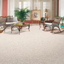
The color wheel is one of the most powerful tools available
for home decorating...if you know how to use it.
|
|
|
And learning it isn't difficult.
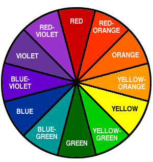
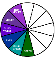
The color wheel is made up of only twelve colors. Learn how
these twelve mix and match with the illustrations below, and
you're on your way to creating a color scheme for every room
in your home.
You'll also be ready when designers or salespeople talk
about warm versus cool, complimentary versus contrasting,
and more.
|
|
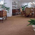
Primary Colors - Red, Blue, and Yellow
|
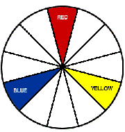
Probably the first lesson you ever learned about color
was that red, blue, and yellow are the primary colors. Every
other color is made up of some combination of these three.
When selecting carpet, you may not choose the bright
boldness of a pure primary color. But certain versions of
the primary colors, like maroon, navy, or gold, can be the
perfect choice for your home.
|
|
Secondary Colors - Orange, Green, and Violet
|

Secondary colors lie between the primary colors on the
color wheel. These colors result from two primary colors
being mixed together.
yellow red = orange
yellow blue = green
red blue = violet
|
|
Intermediate Colors - The Remaining Six
|
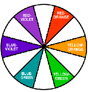
Intermediate colors--also called Tertiary colors--result
from one primary color and one secondary color being mixed
together.
The six intermediate colors are: blue-violet; red-violet;
red-orange; yellow-orange; yellow-green; and blue-green.
Neutrals--black, white, gray, and every variation in
between--are not part of the color wheel.
|
|
Those are the basics...now for the mixing and matching that
can simplify your decorating and flooring decisions.
|
|
|
|
Complementary Colors
|
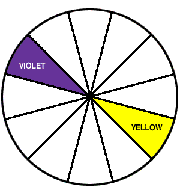
Colors that lie opposite each other on the wheel are
complementary. The complementary color for yellow, for
example, is violet. For orange, it's blue. Pairing a color
with its complementary color will make both colors more
vibrant.
|
|
Analogous Colors
|
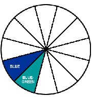
Colors that lie beside each other on the color wheel are
analogous. They can be mixed without clashing because they
share a common color or hue.
|
|
Monochromatic Colors
|
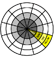
Each single color on the color wheel has a variety of
shades. The color violet, for example, can range from a deep
eggplant to a light lavender. Using various tones of a
single color creates a monochromatic design.
|
|
Triad Colors
|
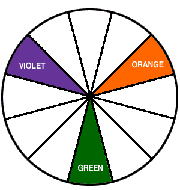
A combination of three colors that are equally spaced on
the color wheel is known as a triad. These combinations can
create a bold, yet balanced decorating palette.
|
|
Be cool . Or warm.
|

You'll often hear discussions about the relative
temperature of a color, whether it's cool or warm. The color
wheel tells you which.
Half of the color wheel--from red to yellow-green--is
considered warm. These colors appear as if they are
advancing toward you, appearing nearer. They can help create
a warm, cozy atmosphere.
|
|
|
The other half--from green to red-violet--is considered
cool. These colors appear to recede, as though the space is
expanding.
Green and violet may appear to advance or recede, depending
on the colors used with them. So some interior designers
consider them neutrals that can complement any color scheme.
Can you mix warm and cool colors? Absolutely. In fact, a
warm color scheme often benefits from at least a hint of a
cool color to create balance. And a cool scheme may need a
burst of warmth to liven it up.
The combination of warm and cool colors generally
intensifies the relative temperature of each. One room
featuring a predominantly warm color next to a predominantly
cool room can make the rooms seem more intensely warm or
cool. Consider this effect when selecting your flooring or
carpet.
|
|
Other helpful definitions:
|
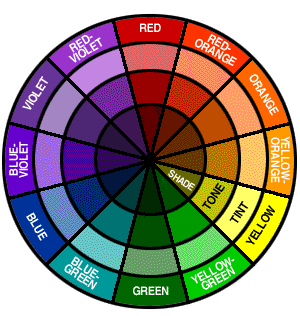
Hue: Another name for color
Value: the lightness or darkness of a color
Intensity: the brightness or dullness of a color
Tint: color + white, resulting in a lighter value
Tone: color + grey, resulting in a darker value
Shade: color + black, delivering the darkest versions
of color
|
|
| |
 | |  |