Area Rugs : Carpeting : Ceramic / Porcelain Flooring : Laminate Flooring : Natural Stone Floors : Specialty Floors : Vinyl / Resilient Flooring : Wood Flooring :


  • livingroom-net21
  • bedroom22-net21
  • entranceway-net21
  • kitchen19-net21
  • livingroom29-net21
livingroom-net211 bedroom22-net212 entranceway-net213 kitchen19-net214 livingroom29-net215
Call 978-658-9694 for fast dependable service!!!
corner corner
 
Room Design Ideas
Basements
Bathrooms
Bedrooms
Craft/Sewing Rooms
Dining Areas
Dressing Room/Closets
Drive/Walkways
Family Room/Dens
Foyers/Entry
Home Office/Study
Kids Bathrooms
Kids Bedrooms
Kitchens
Laundry Rooms
Living Rooms
Nooks/Niches/Bars
Nursery/Baby Rooms
Play Rooms
Pool Patio Decks
Staircases
Sunrooms
Corridors
Entranceways
Lobbies
Meeting Rooms
Other
Restrooms
Stairs/Stairwells
Athletic/Recreational
Educational/Schools
Hospitality/Hotels
Institutional/Public
Medical/Healthcare
Office/Tenant
Residential Home
Resturants/Bars
Retail/Shopping
 
corner corner
Home|About Us|References|News & Events|Contact Us |Locations & Hours|Videos  Visit us on Twitter Visit us on Facebook 
Welcome
The color wheel is one of the most powerful tools available for home decorating...if you know how to use it.


And learning it isn't difficult.

The color wheel is made up of only twelve colors. Learn how these twelve mix and match with the illustrations below, and you're on your way to creating a color scheme for every room in your home.

You'll also be ready when designers or salespeople talk about warm versus cool, complimentary versus contrasting, and more.


Primary Colors - Red, Blue, and Yellow

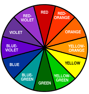
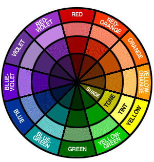
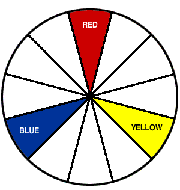
Probably the first lesson you ever learned about color was that red, blue, and yellow are the primary colors. Every other color is made up of some combination of these three.

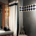
When selecting carpet, you may not choose the bright boldness of a pure primary color. But certain versions of the primary colors, like maroon, navy, or gold, can be the perfect choice for your home.


Secondary Colors - Orange, Green, and Violet

Secondary colors lie between the primary colors on the color wheel. These colors result from two primary colors being mixed together.

yellow red = orange
yellow blue = green
red blue = violet


Intermediate Colors - The Remaining Six

Intermediate colors--also called Tertiary colors--result from one primary color and one secondary color being mixed together.

The six intermediate colors are: blue-violet; red-violet; red-orange; yellow-orange; yellow-green; and blue-green.

Neutrals--black, white, gray, and every variation in between--are not part of the color wheel.


Those are the basics...now for the mixing and matching that can simplify your decorating and flooring decisions.


Complementary Colors

Colors that lie opposite each other on the wheel are complementary. The complementary color for yellow, for example, is violet. For orange, it's blue. Pairing a color with its complementary color will make both colors more vibrant.


Analogous Colors

Colors that lie beside each other on the color wheel are analogous. They can be mixed without clashing because they share a common color or hue.


Monochromatic Colors

Each single color on the color wheel has a variety of shades. The color violet, for example, can range from a deep eggplant to a light lavender. Using various tones of a single color creates a monochromatic design.


Triad Colors

A combination of three colors that are equally spaced on the color wheel is known as a triad. These combinations can create a bold, yet balanced decorating palette.


Be cool . Or warm.

You'll often hear discussions about the relative temperature of a color, whether it's cool or warm. The color wheel tells you which.

Half of the color wheel--from red to yellow-green--is considered warm. These colors appear as if they are advancing toward you, appearing nearer. They can help create a warm, cozy atmosphere.


The other half--from green to red-violet--is considered cool. These colors appear to recede, as though the space is expanding.

Green and violet may appear to advance or recede, depending on the colors used with them. So some interior designers consider them neutrals that can complement any color scheme.

Can you mix warm and cool colors? Absolutely. In fact, a warm color scheme often benefits from at least a hint of a cool color to create balance. And a cool scheme may need a burst of warmth to liven it up.

The combination of warm and cool colors generally intensifies the relative temperature of each. One room featuring a predominantly warm color next to a predominantly cool room can make the rooms seem more intensely warm or cool. Consider this effect when selecting your flooring or carpet.


Other helpful definitions:


Hue: Another name for color

Value: the lightness or darkness of a color

Intensity: the brightness or dullness of a color

Tint: color + white, resulting in a lighter value

Tone: color + grey, resulting in a darker value

Shade: color + black, delivering the darkest versions of color


Click here for larger photo of Kathy Ireland Rugs
Click here for larger photo of Shaw Laminate - Natural Treasures
Click here for larger photo of Estate
Click here for larger photo of Galleria
Click here for larger photo of Cotto Antico™
Click here for larger photo of Vitrestone Select™
Click here for larger photo of Ash - Butterscotch
Call: 978-658-9694  Contact Us